
Role
UI Designer
Duration
9 weeks (Nov 2022 - Jan 2023)
Tools
Purpose
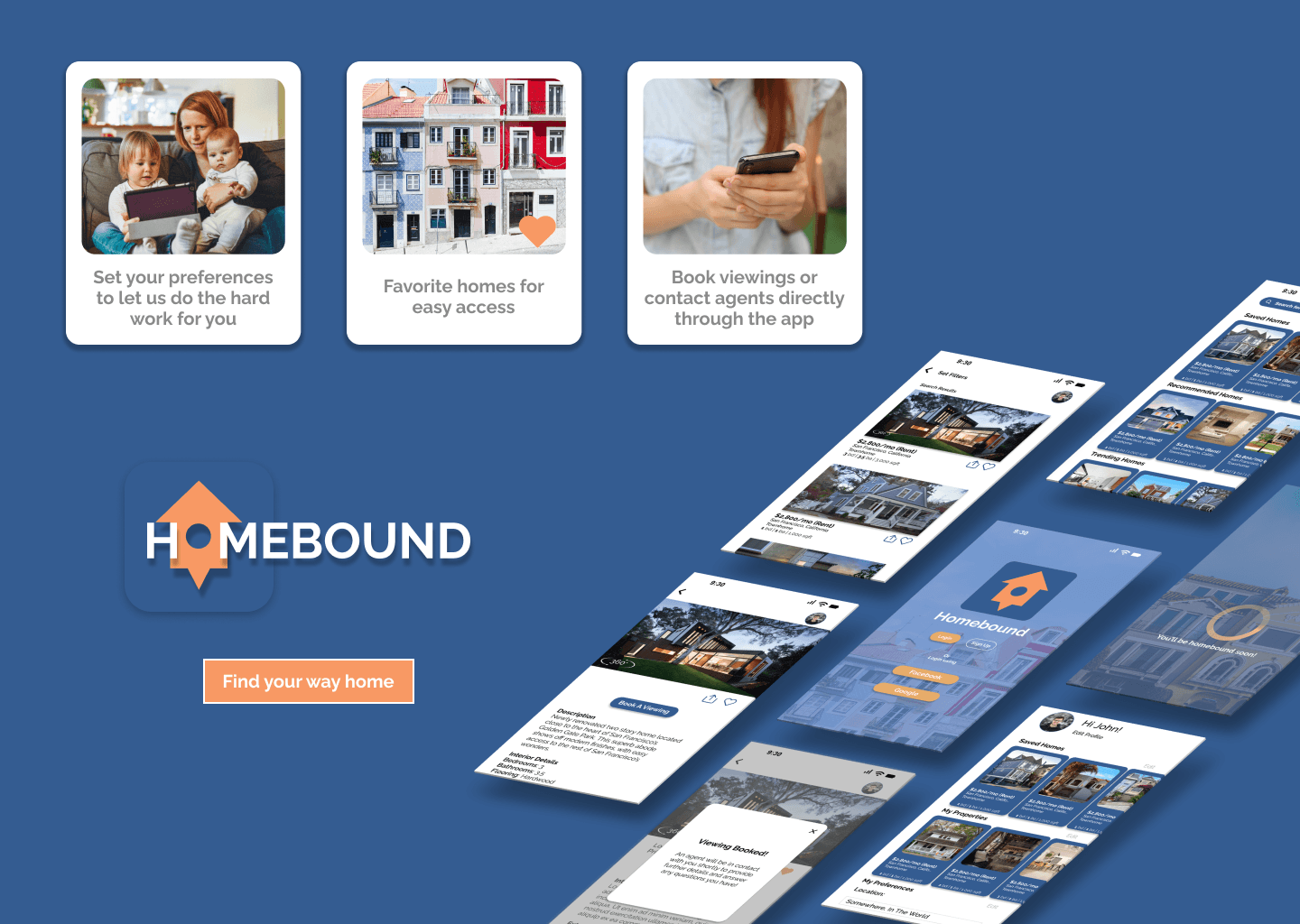
As the CareerFoundry UI design course project, the project brief provided initial research and I was tasked with creating the UI of this real estate app. I did my research through competitive analysis with some of the current home renting/buying apps to find what were some of the ideal features users needed to complete their goals.
Objective
With initial UX research and project brief given, design a responsive web app that provides prospective property buyers with information on properties of interest.
Problem
Users looking to get into real estate need a way to easily find homes within their own preferences and access information to help them make educated decisions.
Solution
Design a home real estate app that feels professional and is inclusive to those with limited home investment knowledge.
My Persona

Hi Rashida!
"I want to provide my family with financial security. I've been considering buying property for a while, and am looking for a tool that can help me find what I'm looking for quickly!"
Goals
Rashida makes a good living and wants to invest in property beyond the city for increased financial security for her family.
She wants to make an informed decision before committing to a property.
She wants a tool to help her find the right properties so as not to waste her time.
Needs
Search for properties, inputting criteria relevant to what she's looking for.
Easily view and return to listings she's interested in.
Receive relevant and comprehensive information about properties.
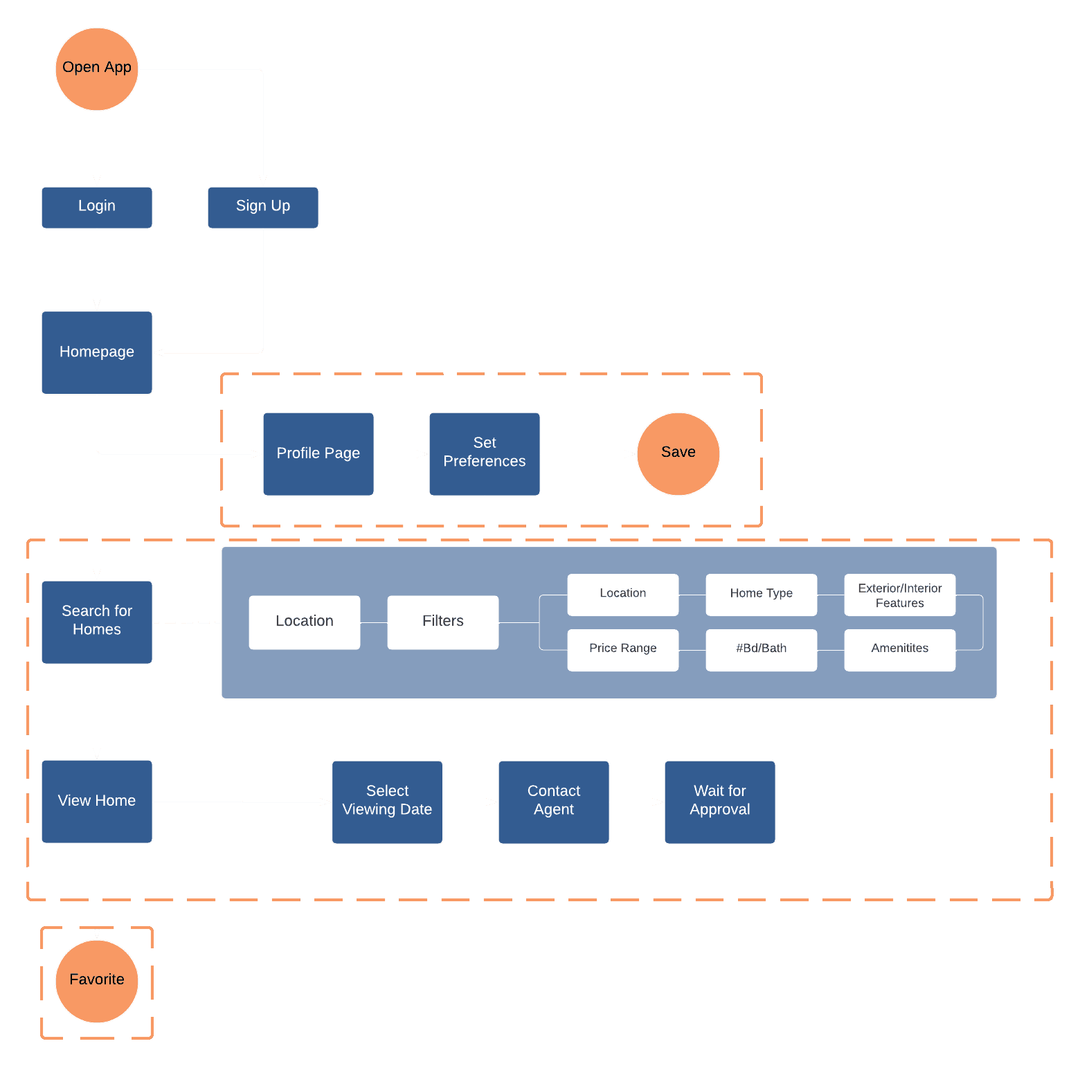
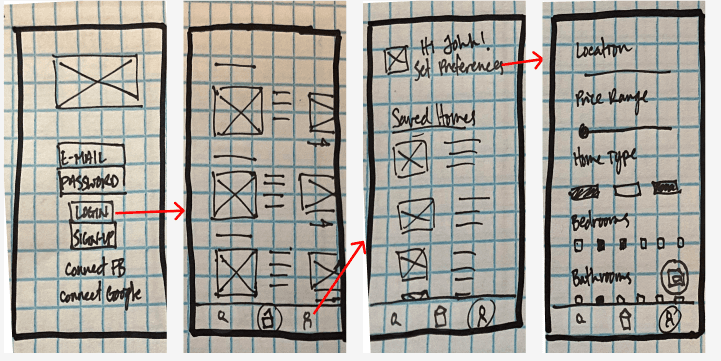
After reviewing the project brief and creating the persona, I translated their goals and needs into user stories. These stories helped me shape user flows that revealed what screens and interactions to make into low-fidelity prototypes.
01
02
03
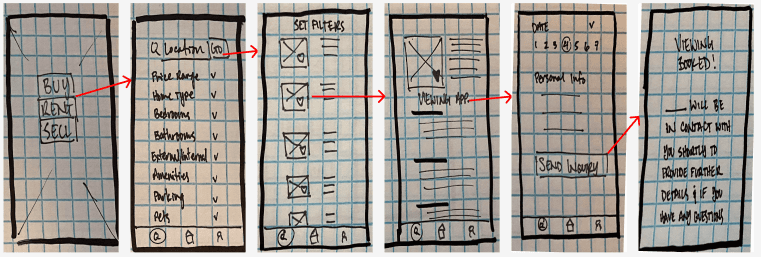
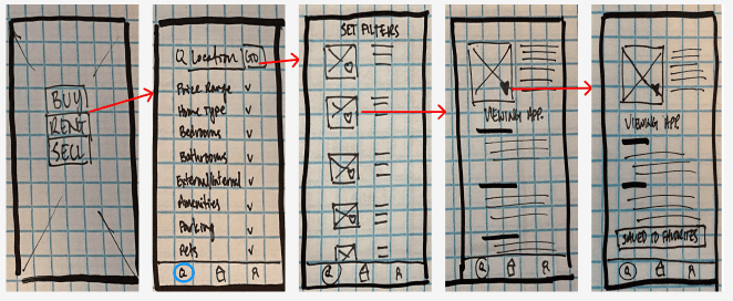
"As a user, I want to create a profile containing all my property criteria, so that I am recommended results that are most relevant to me."
"As a user, I want to save properties I am interested in so that I can easily revisit them."
As a user, I want to be able to contact the right people if I am interested in viewing a property so that I can schedule a viewing."
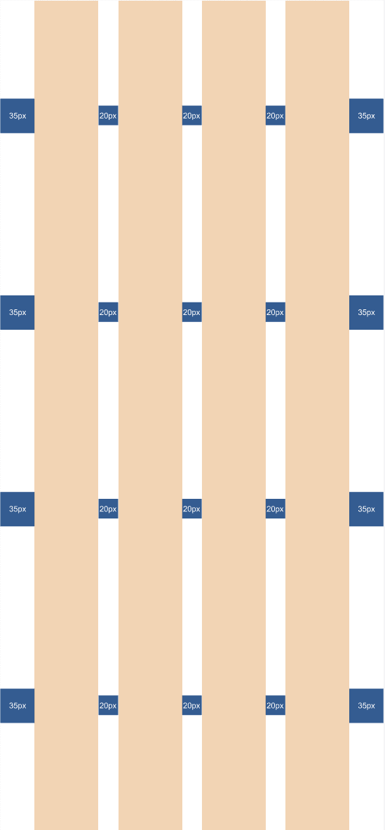
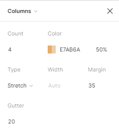
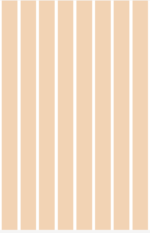
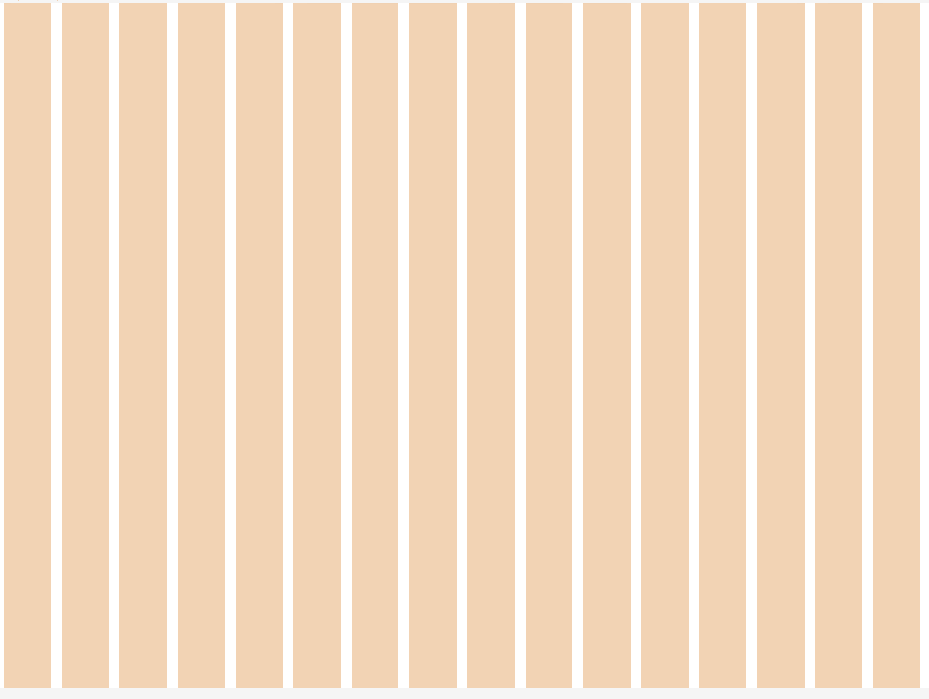
Grid System
One of the key takeaways I learned in the UI course was that when designing a responsive web page, it would be easier to design the larger breakpoints later if I were to start with a mobile first design mindset.
Mood Board
Before continuing to a high fidelity design, I revisited the project brief to find some information that would help me in deciding the overall feel for the design of the app and discovered these key words
Since real estate involves significant financial decisions, it’s crucial that users feel safe and well informed. My goal is to design the app with the above keywords in mind, while also making the home-search process engaging and enjoyable to keep users motivated throughout their journey.
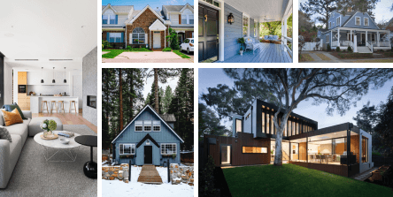
Option 1
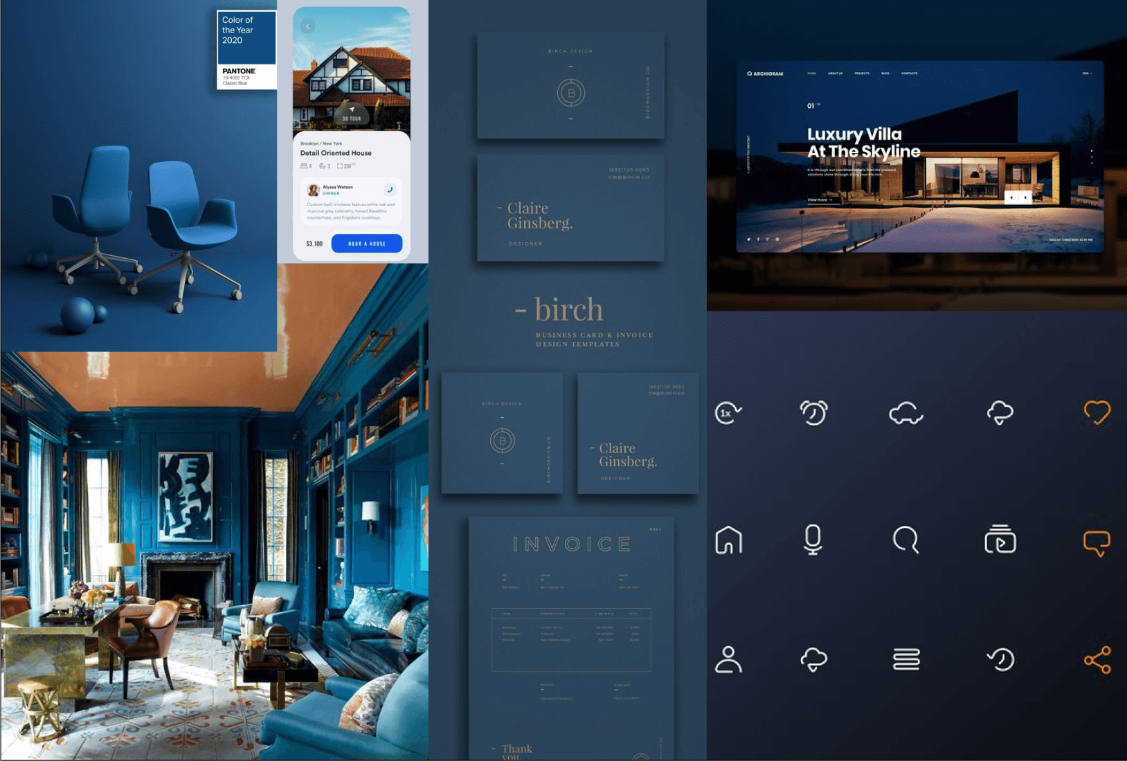
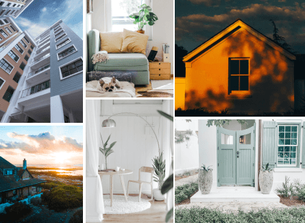
Option 2

Decision & Rational
Of the two mood boards I came up with I decided to move forward with option 2 because it balances excitement with a clean, professional, and minimal look while giving a better idea of the color palette as a whole. Given the project brief’s emphasis on quick, easy task completion, this direction better conveys efficiency and reliability to stakeholders.


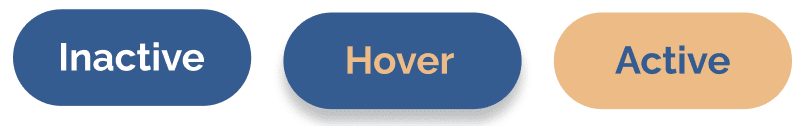

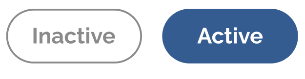
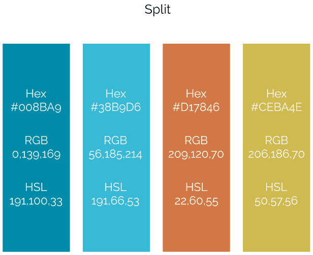
Style Guide
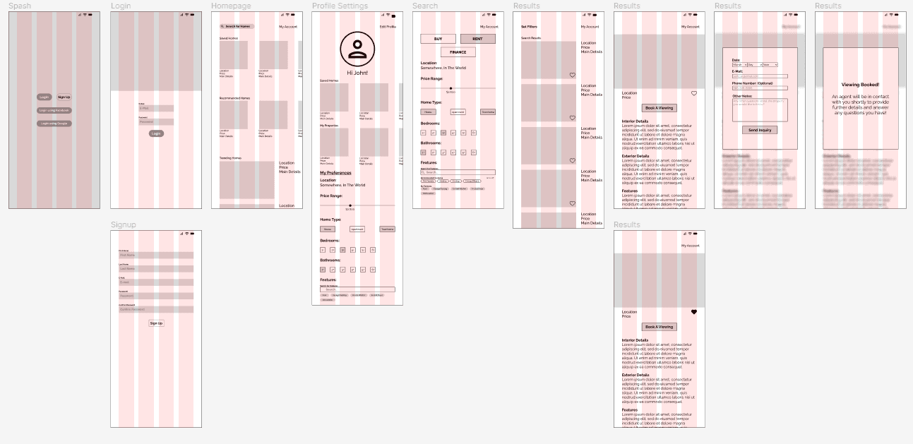
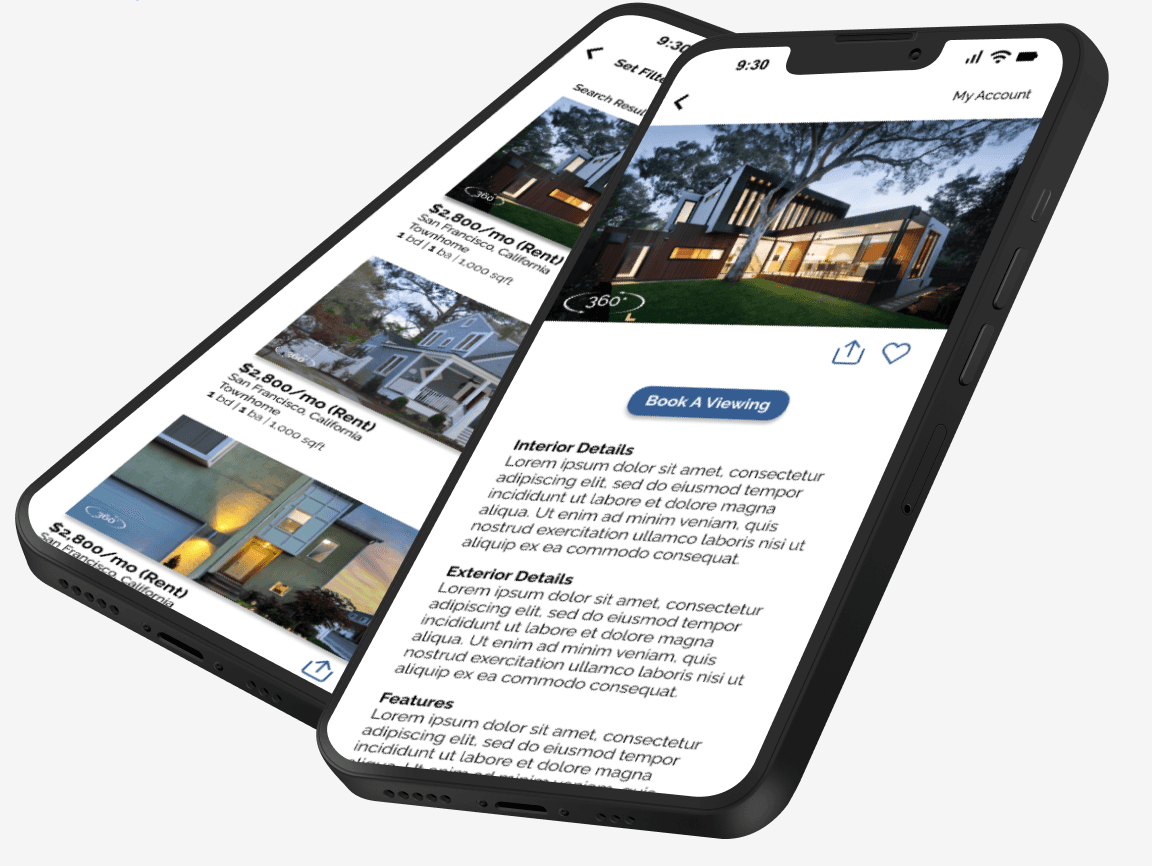
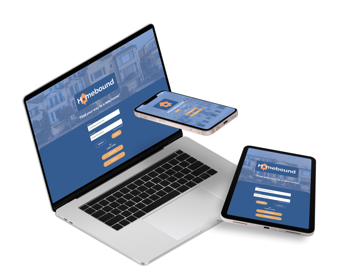
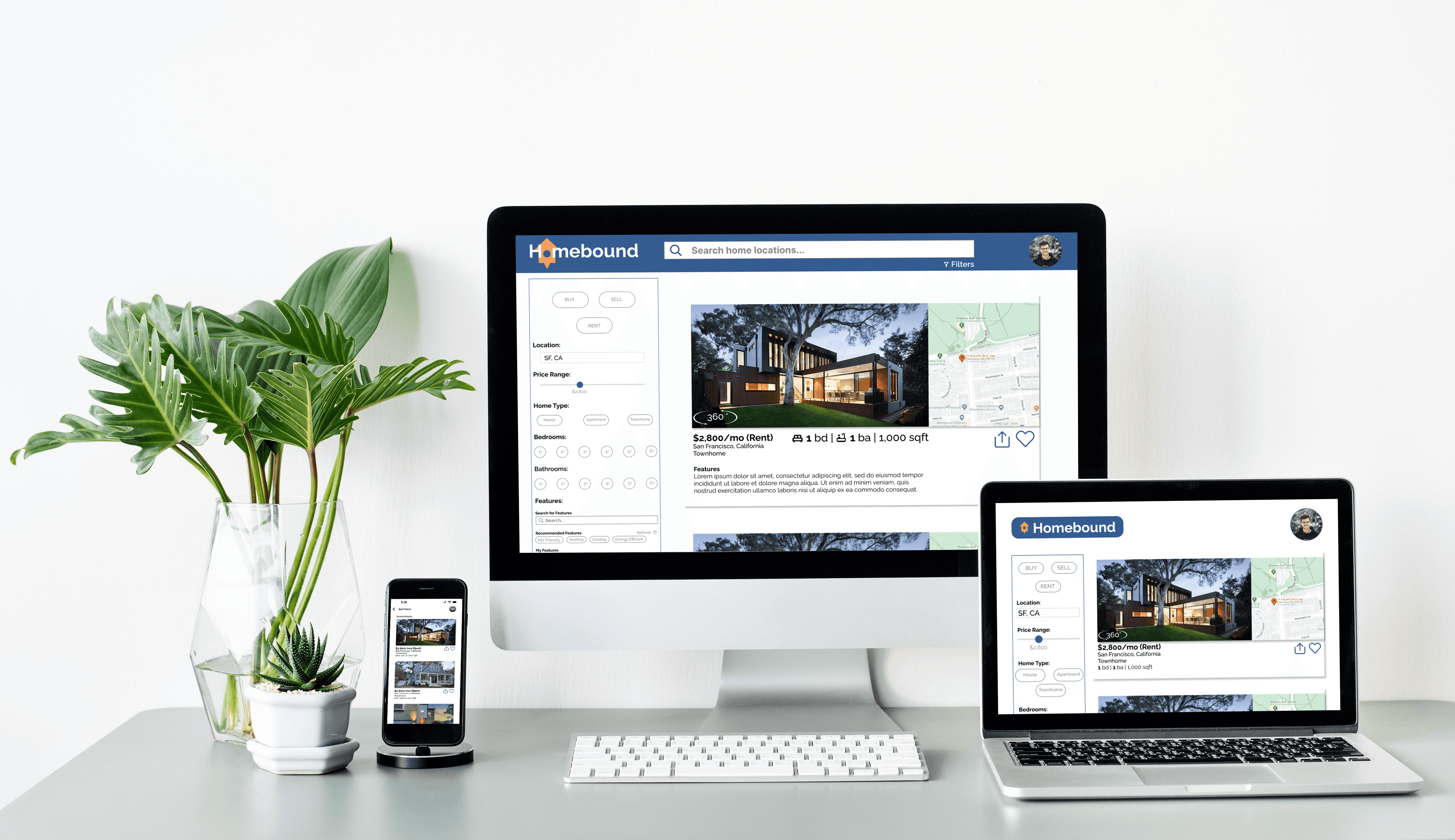
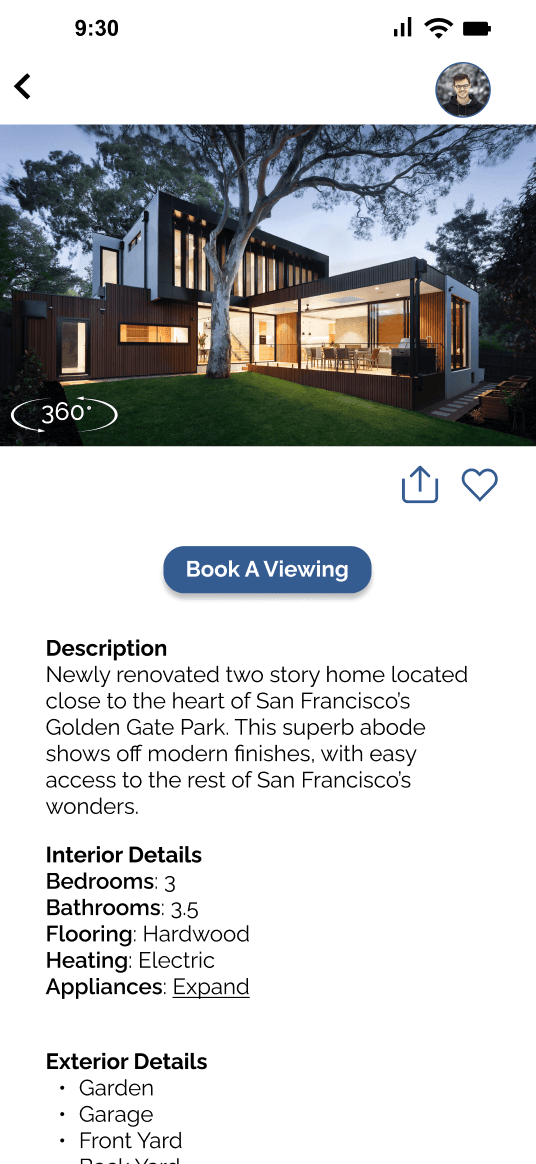
High Fidelity Breakpoints
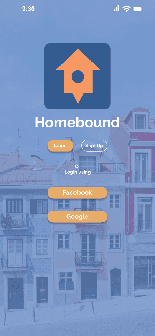
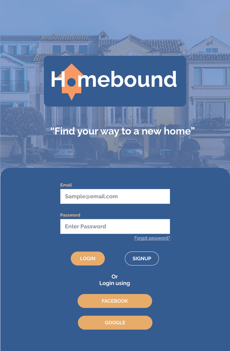
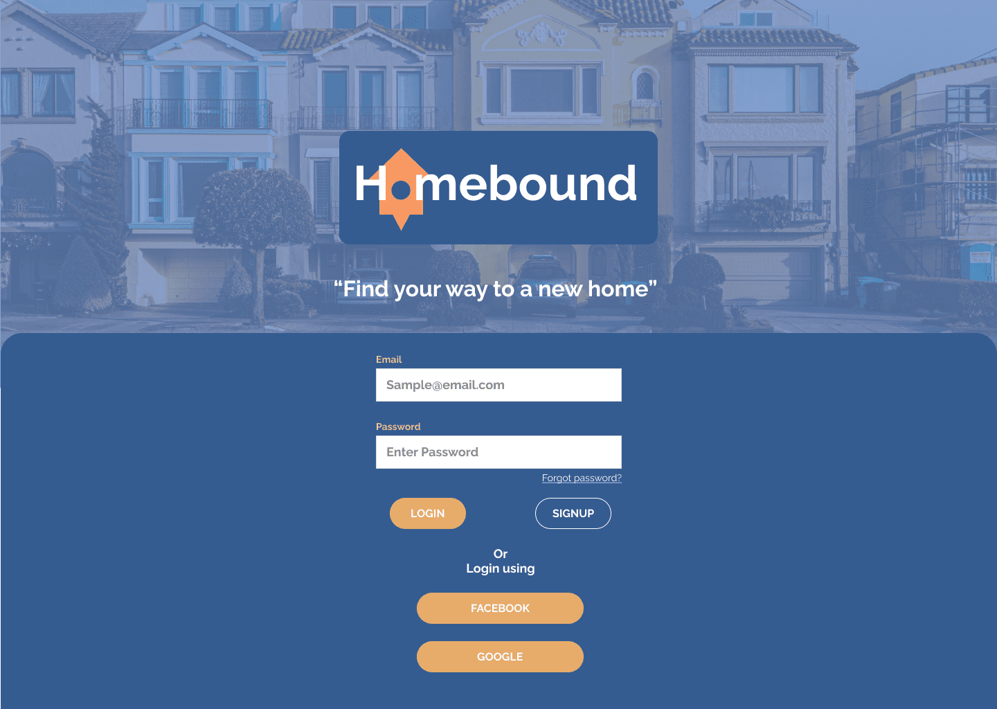
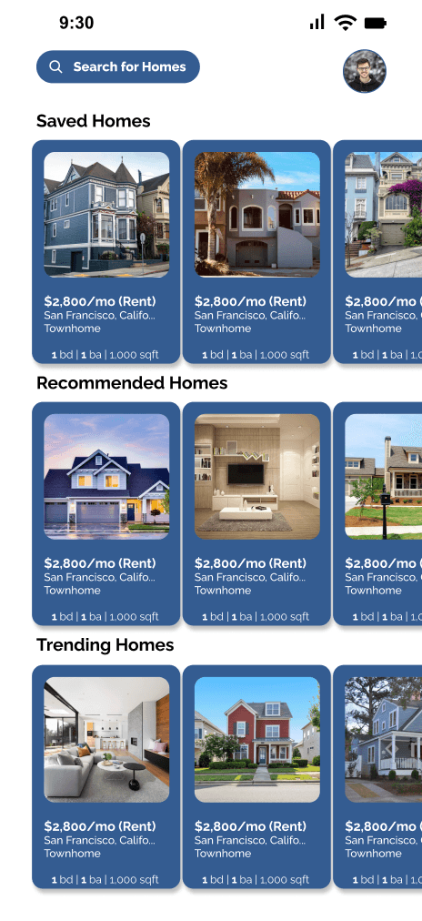
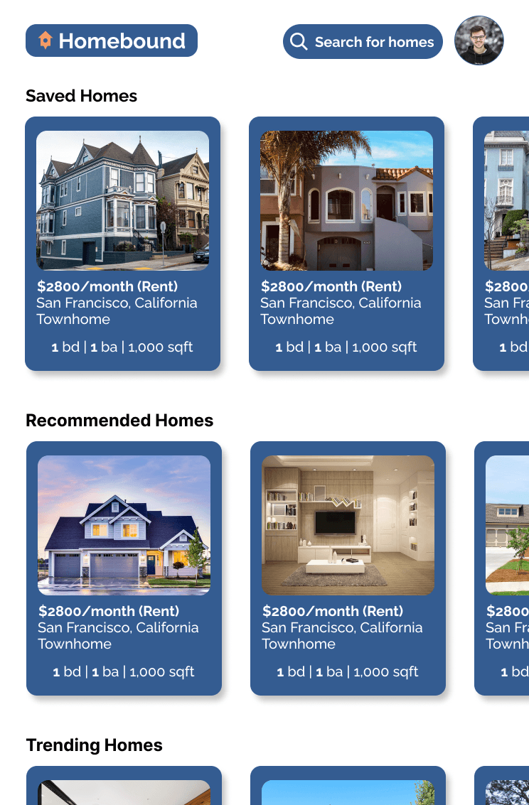

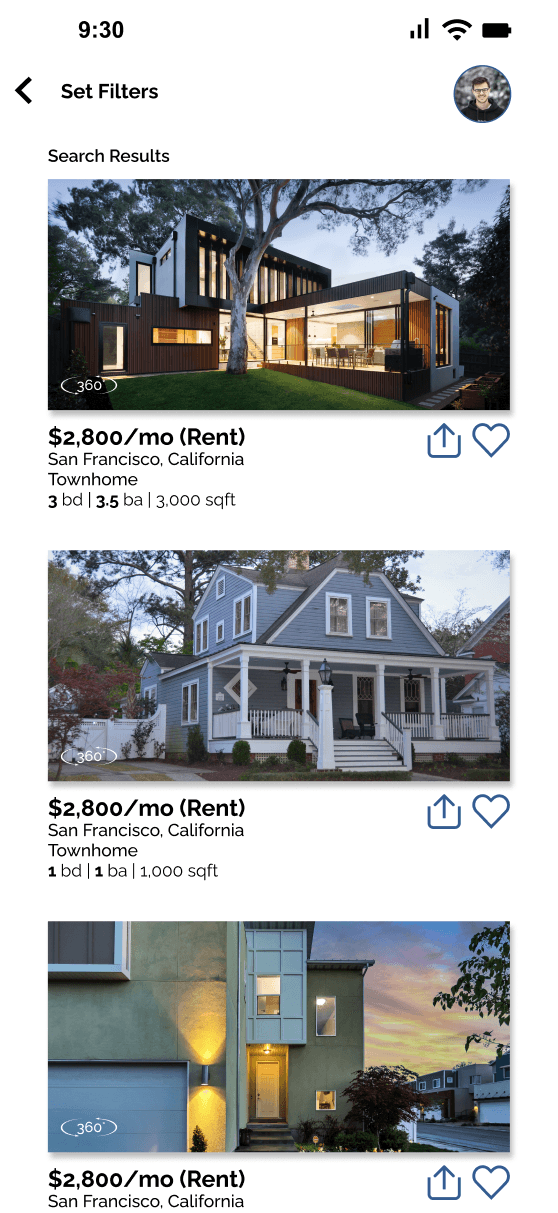
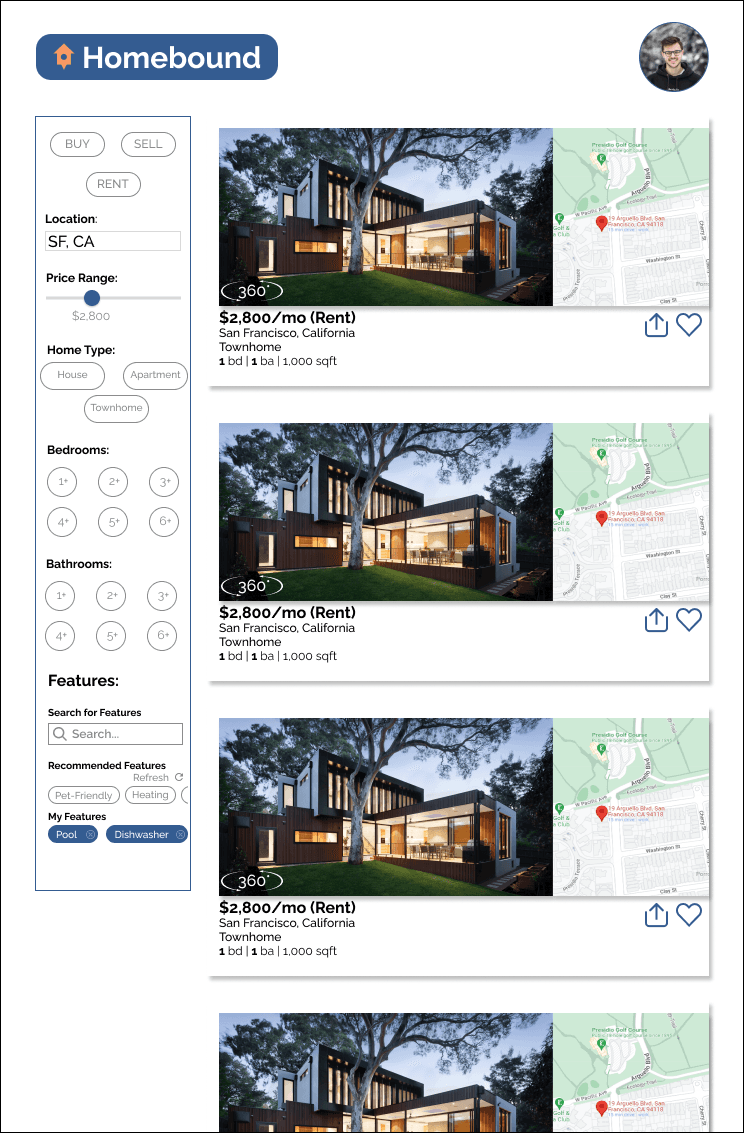
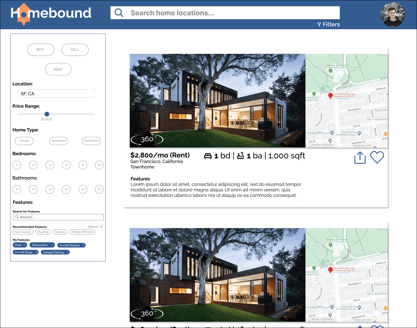
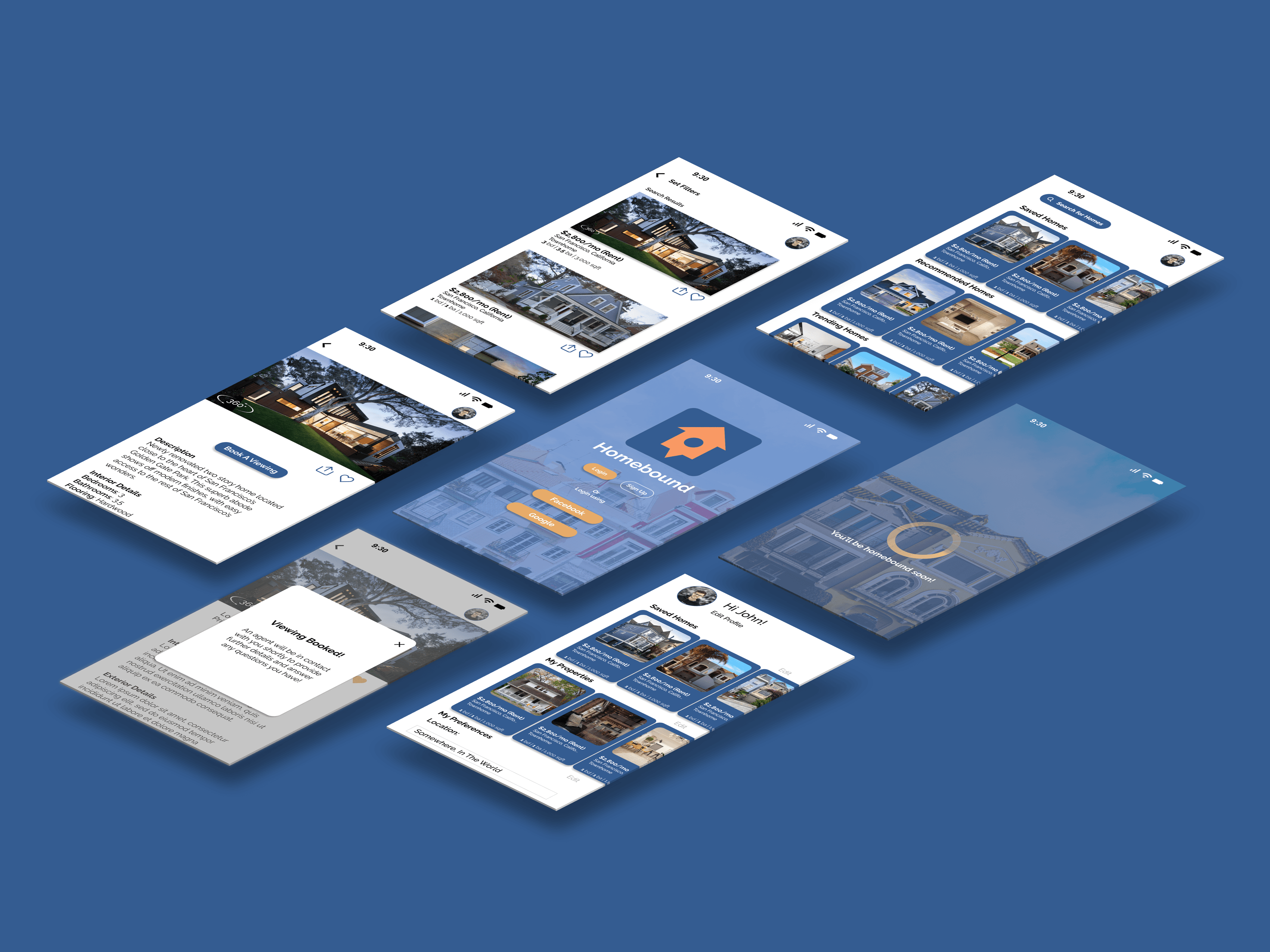
Mockups
Loading Animation
Clickable Prototype